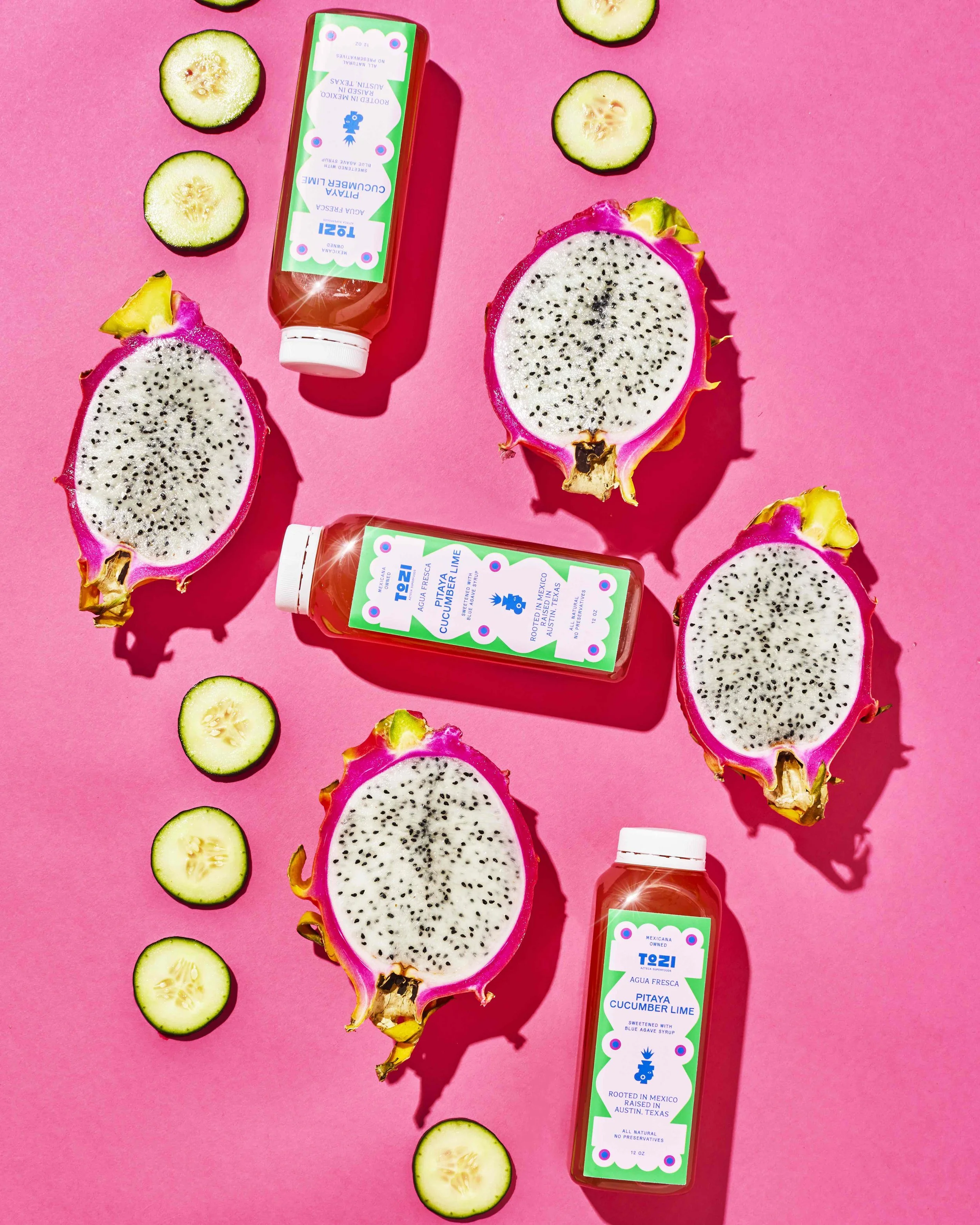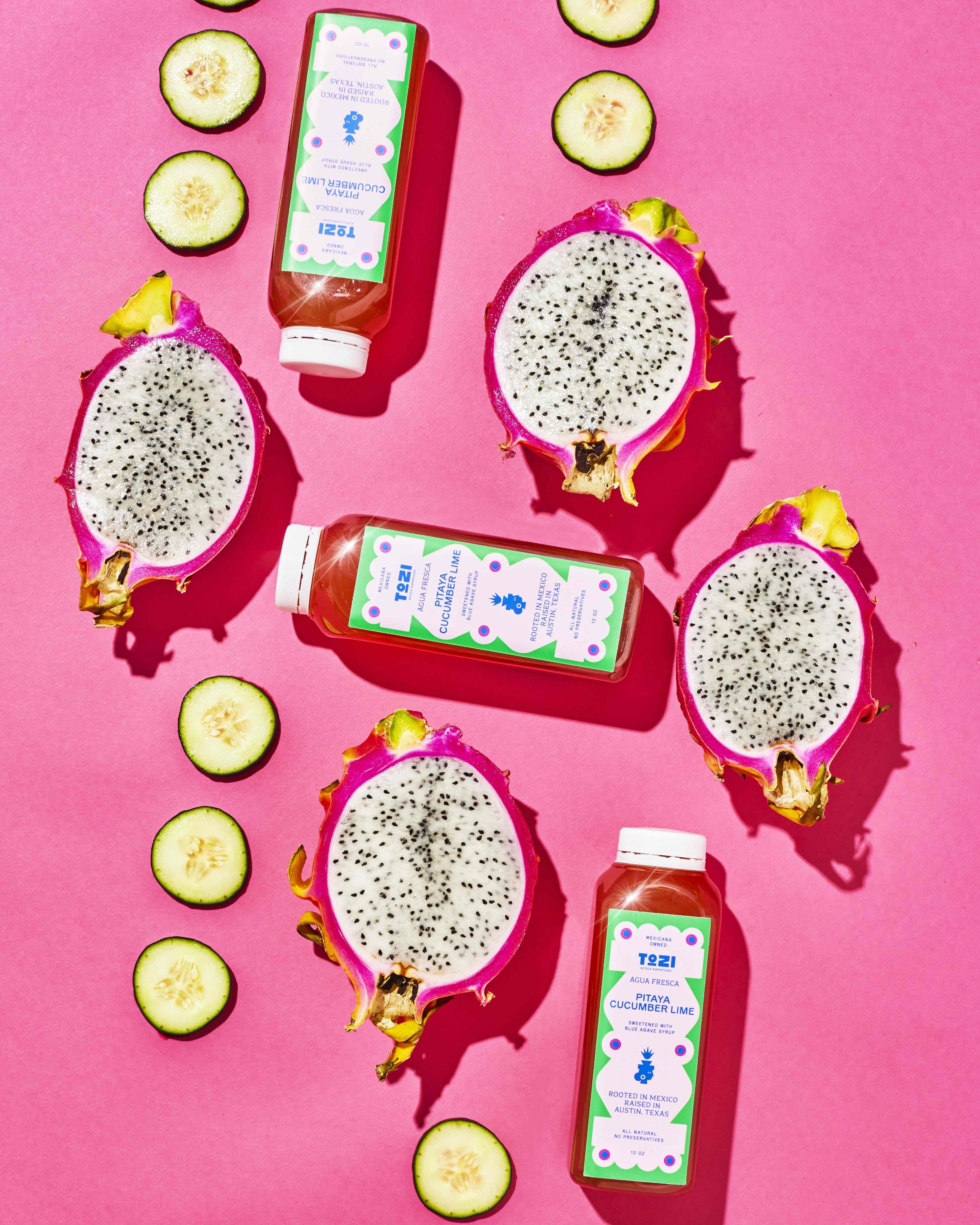
With family lineage in Mexico that dates back to the late 1500s, the Mexicana-owned Tozi Azteca Superfoods blends traditional Mexican flavors with modern nutrition for delicious, health-forward food products like non-GMO tortillas, chips, and organic aguas frescas. They craft their products using potent indigenous superfoods like amaranth, agave, and nopal, catering to health-conscious consumers looking for culturally rich, nutritious options.
Inspired by the Aztec goddess of health, Tozi, and a line of Mexican matriarchs, Tozi Azteca Superfoods celebrates and honors Mexico's rich culinary heritage, bridging the gap between tradition and modernity. With a core central concept of "where heritage meets health," Tozi crafts products that are not only delicious but also culturally significant, showcasing the diverse and dynamic nature of Mexican food.

Approach
In collaboration with Sofia Llaguno, Our mission was to help Tozi level up—from a start-up you'd find at your local farmer's market to a retail-ready, Whole Foods and Walmart star aimed at traditional Latino households in addition to Gen Z Latinos, plus, anyone who is mindful of their health and wellness. This truly was a brand for all, and there was also an educational element as well, as we knew Tozie needed to win over older generations. We also wanted to emphasize that this was a Chicana-founded brand that was 100% female-led.
We identified four critical pillars that would guide our brand refresh.
Cultural Respect & Authenticity: Tozi is a brand built on honoring the legacy of Mexican cuisine and the indigenous superfoods that have sustained generations. Respecting these traditions meant celebrating their heritage through design elements and visual language.
Community Empowerment & Representation: The brand celebrates the strength and resilience of Latina entrepreneurs and their contributions to the culinary landscape. We celebrate and promote cultural identity and heritage within the company's brand and operations and engage in advocacy efforts that address social and economic disparities faced by Latinx communities.
Health & Wellness: Tozi's superfood-infused products promote a healthy lifestyle. The design needed to convey this focus on well-being through clean, modern aesthetics and clear messaging about the nutritional benefits of their ingredients.
Education & Advocacy: We teach consumers about the nutritional benefits and cultural significance of indigenous superfoods and advocate for policies that support small-scale farmers, community programs, and sustainable agricultural practices
Solution
When the owner was thinking about putting together a brand name for what is now known as Tozi, she knew it needed to tie into Aztec culture and femininity, as the brand is Mexicana-owned. Tozi is owned and run by a family of strong, Mexican women based in Texas—that's where Tozi came into play. Tozi, or Toci, is the Aztec goddess of health and she both aligns and stands for all that Tozi does. What's more, Tozi's products all feature ingredients rooted in ancestral knowledge, health, and wellness.
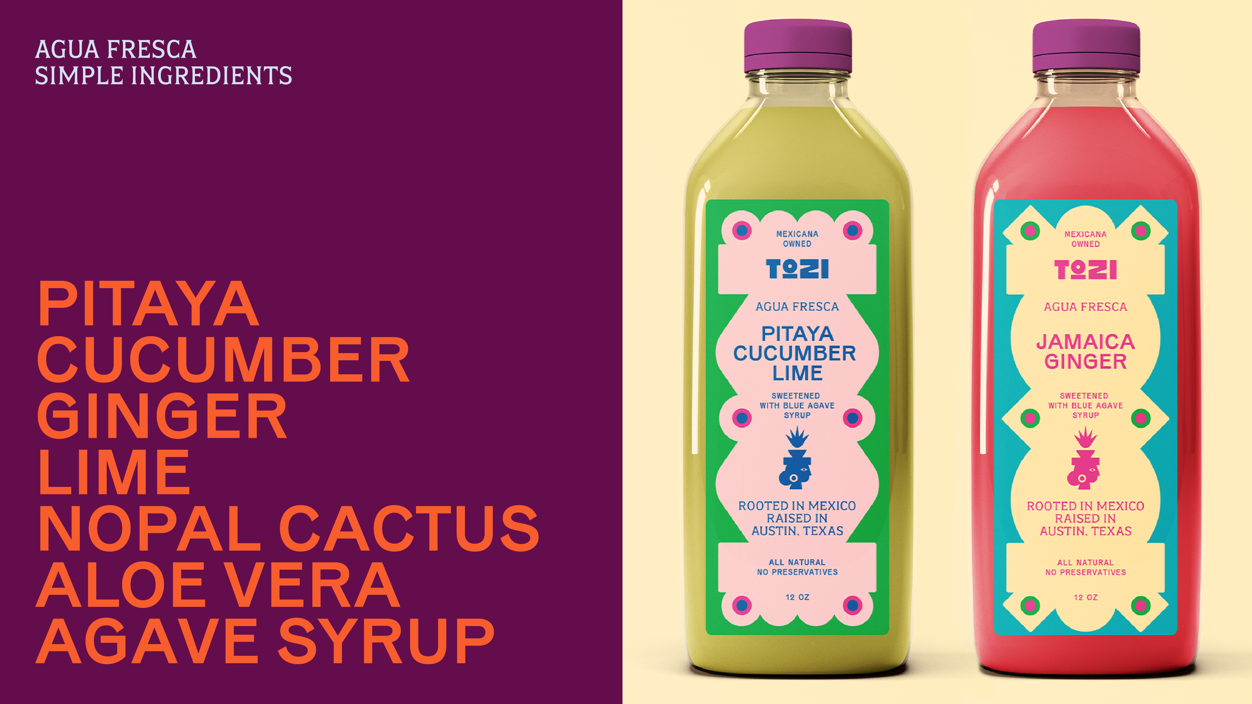
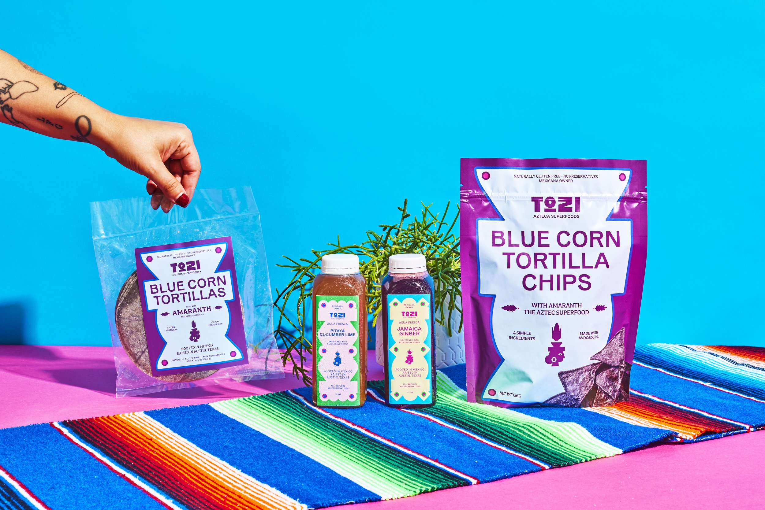
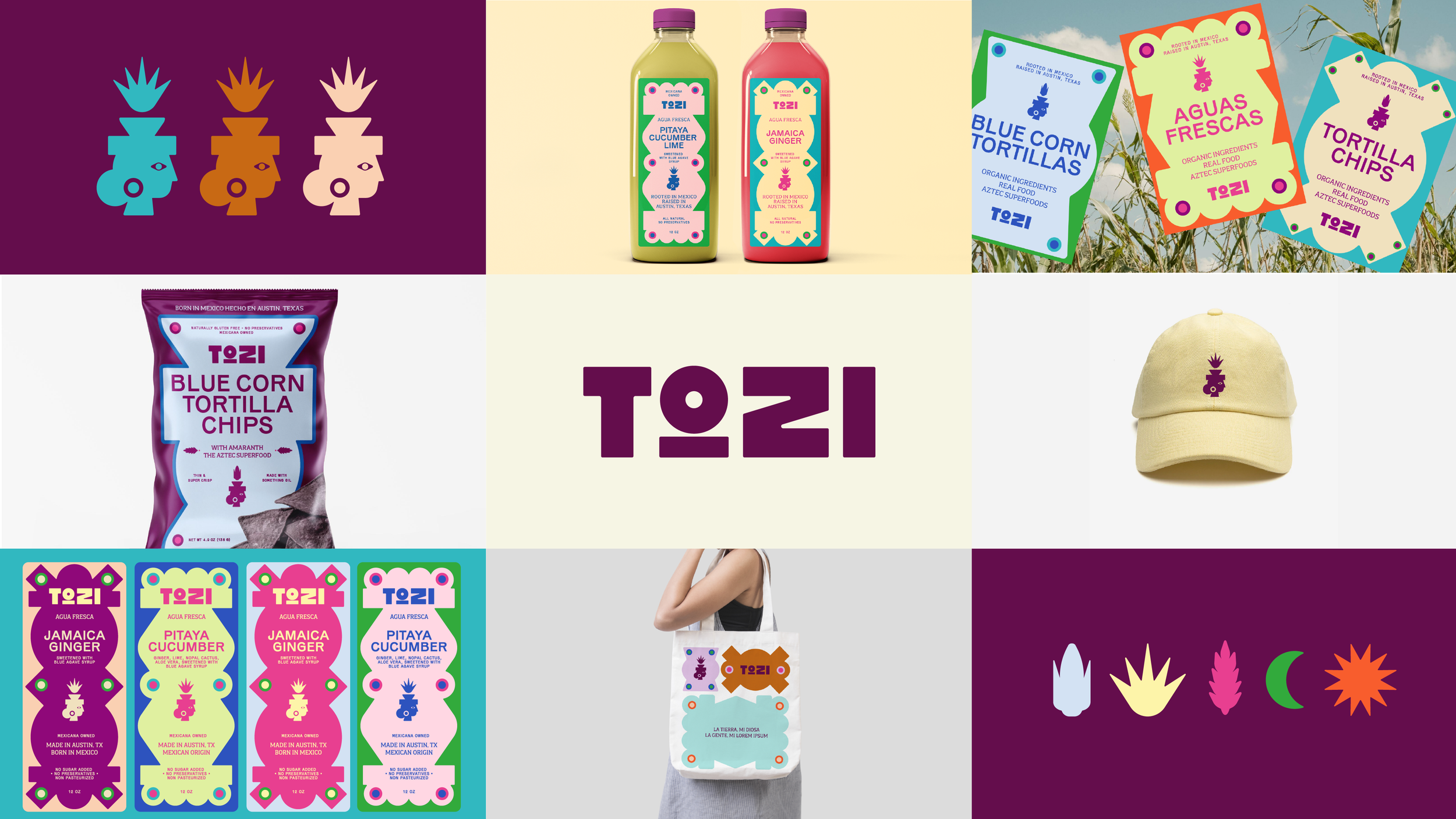
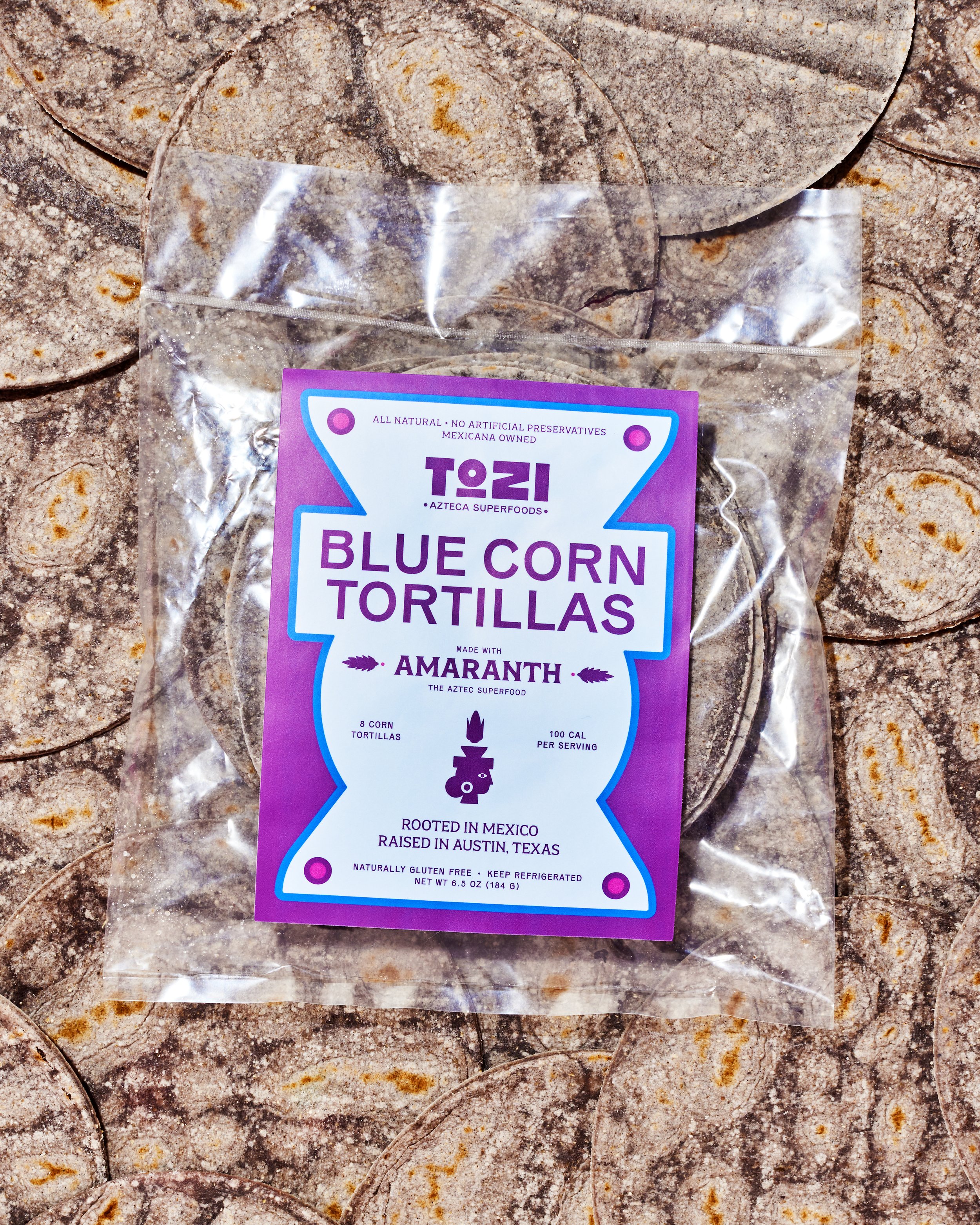
Callouts on the packaging were highly intentional, as this wasn't just a woman or Latina-owned brand. We wanted to be specific and say "Mexicana Owned" as the founder was proud not just of her heritage but of their family farm in Jalisco. It’s also a conversation starter, as it’s a piece of storytelling that rarely makes an appearance on packaging. That's why we added "rooted in Mexico, raised in Austin" on the packaging, as it was something distinctive and ownable for the brand. For the brand's tone of voice, we wanted it to resonate with a broad audience, and we crafted a brand tone that's confident, empowering, and passionate while remaining culturally rich and proud. It's also vibrant, inviting, relatable, bold, light, and fun.
In addition to a streamlined wordmark, we redesigned Tozi's logo, transforming the brand's original illustration of a goddess into a simplified icon. The revamped logomark visually connects the brand to its heritage and core values. Influenced by Aztec stone sculptures and the gods, we looked at the shapes and symmetry of many of the statues and stone carvings that were prevalent at the height of the Aztec Empire. Further, architecture from that era inspired many of the graphics on the packaging and served as a framing device for the visual identity system.
With the refreshed identity in place, Tozi Azteca Superfoods is poised to move beyond the farmer's market and become a household name on the national stage. The strategic rebrand, rooted in Tozi's heritage and roots, successfully blends tradition and modernity, paving the way for a future filled with tasty, health-conscious products that celebrate the rich culinary culture of Mexico.


